This name brings a new life to the project and platform which is underpinned by our values of Māori Data Sovereignty as well as having a future-focus that places rangatahi at the centre of our mahi.
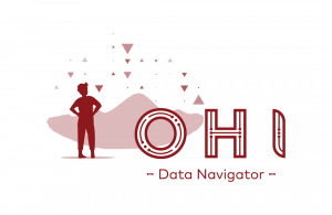
Each element of our tohu or logo tells its own kōrero or story. You could start with any component and see that they are all interconnected, but let’s start with our name.
OHI Data Navigator
The kupu / word ohi in te reo Māori means to grow. Many in the youth sector use the kupu taiohi interchangeably with rangatahi, which means young, or youthful. Not only does this kupu speak to those we hope will benefit from greater understanding (young people), but for us it opens up the possibilities of what we can achieve with this project.

Niho Taniwha
The stars / consellation of our tohu take the form of the niho taniwha or the teeth of the taniwha. These represent unity or strength and when presented as a constellation like in our tohu represent whakapapa. Whakapapa is about our connections to people, whenua and time.
For us, the constellation represents the connections our rangatahi have with all of the things that will support them to thrive. Whether that’s whānau, hapū, iwi, hapori, kura or school. Or their connections to whānau, or having a place to belong like tūrangawaewae.
Whenua & Waka
Sitting behind the logo is the whenua, shaped like a waka; connecting to the stars as a means of navigation into the future. The whenua grounds us, gives us a sense of belonging, whilst shaped like the waka to give a sense of direction into the future.
Haehae
Within the lettering OHI, we have the haehae, which reinforces the theme of whakapapa and connections. For us, these traditional whakairō or carved patterns also connect us to the tech and data part of this project.
Our tohu or logo grounds our kaupapa through whakapapa and connections whilst looking to the future: a future where rangatahi thrive.


